

Google Now Highlights Mobile-friendly Websites in Search Results
It can be pretty annoying sometimes when you’re browsing the websites on a mobile or smartphone devices, only to find out the site you’re visiting has a terrible layout on your phone. Google wants to make your life a bit easier by highlighting sites that have been optimized for mobile devices in its search results.
April 21st, 2015 Google has applied new indexing rules that are aimed to change the search algorithm for mobile devices. Olga Karavan from Code Production/EZ-BC has shared sa few thoughts on how these changes will affect existing Business Catalyst sites and the advantages of a new algorithm you can benefit from when creating new sites.
What’s Inside New Algorithm
On April 21, 2015, Google has released a significant new mobile-friendly ranking algorithm which means that Google use Mobile Friendliness as a ranking signal. The update doesn’t apply to tablets or desktop, just smartphones, but everyone should make their site mobile friendly, because about 60% of search traffic now comes from mobile.
A page is eligible for the “Mobile-friendly” label if it meets the following criteria as detected by Googlebot:
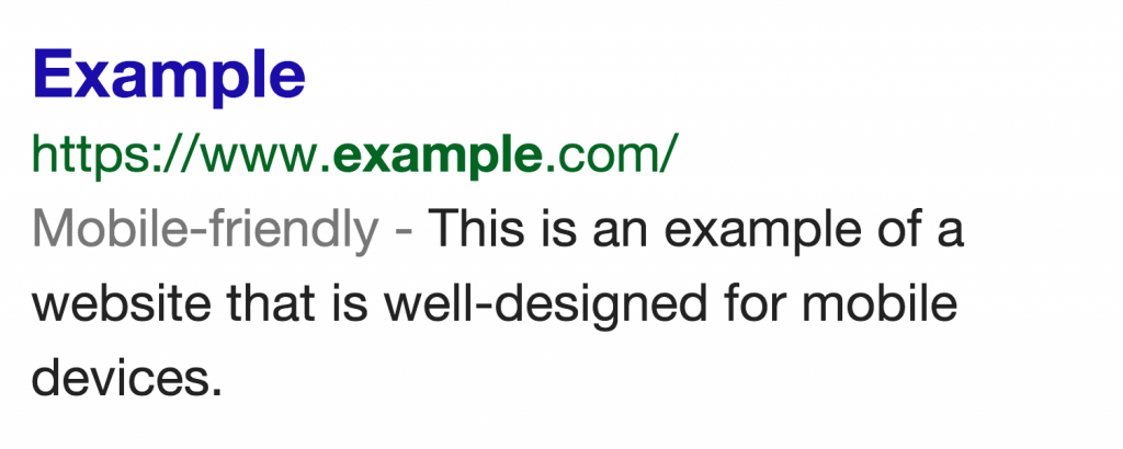
For Google, such a page does the following:
- Avoids software that is not common on mobile devices, like Flash
- Uses text that is readable without zooming
- Sizes content to the screen so users don’t have to scroll horizontally or zoom
- Places links far enough apart so that the correct one can be easily tapped.
If you want to make sure that your page meets the mobile-friendly criteria:
- Check your pages with the Mobile-Friendly Test
- Read our updated documentation on our Webmasters Mobile Guide on how to create and improve your mobile site
- See the Mobile usability report in Google Webmaster Tools, which highlights major mobile usability issues across your entire site, not just one page
- Check our how-to guide for third-party software like WordPress or Joomla, in order to migrate your website hosted on a CMS (Content Management System) to use a mobile-friendly template.
